|
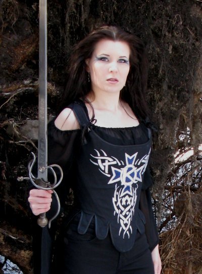
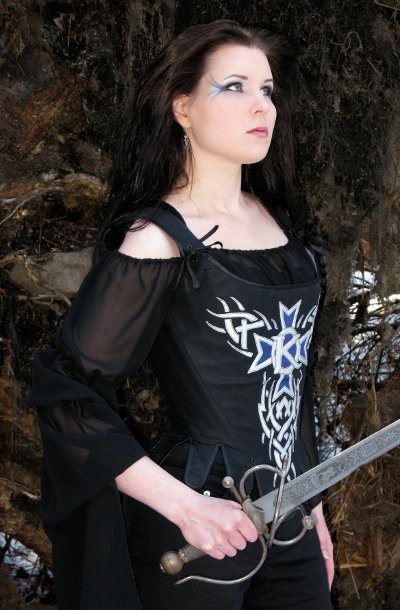
When I first began to think about this
project, I wanted to make Kamelot's original, heraldic
crest-logo, which I still like very much, but it would
have been rather difficult to get to look right, I'm
afraid, so I chose the Epica-era tribal logo instead. It
turned out very nice, going well with the shape of the
stays, especially when I added the tribals on the sides
of the K-cross.
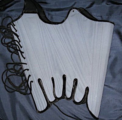
The pattern for the
corset was, unusually for me, a bought one, Butterick's
"Making history" pattern for 18th century stays, which I
ended up altering quite much. There is more about the
pattern on the project page for my white stays.
The
foundation for the stays is two layers of stiff cotton, in
which the channels for the bones are stitched. The boning
is 7mm wide plastic cable tie, which I chose because it
was cheap and as these stays are more decorative than
stiff I thought it sufficient. It worked very well,
actually, the only drawback being that they were quite
thick and will show trough unless the top fabric is quite
thick. My top fabric here is quite heavy, slightly shiny
cotton, and the decoration is of blue satin and silver
lurex.
|
|
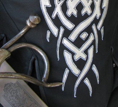
I am not very good in drawing, so I took the
sharpest picture of the logo I could find on internet, and
enlarged it. Then I copied it on film, which I cut to work
as a sablon to help drawing the pieces on the wrong side
of the fabric. I used the sablon again in placing the
pieces on the fabric (which was backed with iron-on
interfacing). I glued them very slightly, so that they
would stay on their places while I stitched them on. I
noticed pretty soon that I should have been more generous
with the glue, because the elastic silver lurex was very
elastic indeed, and also clung to the machine in a most
irritating way.
The finished
appliqué is not quite perfect, because I couldn't
stop for a minute until it was finished, so towards the
end a few stitches went a bit wrong.N No, they are not
visible to my critical eyes only, so far at least one
other person has noticed them too.
|
|
The rest of the making served as much needed
practice for my real 18th century stays project. Among other
things I learned that as sewing machine was a thing of the
future at the time this type of garment was worn, its really
designed to be made by hand, and cannot be rushed in a hurry
with a machine - at least not all of it. A lot of cursing
was heard when I tried to edge the waist tabs, trying to
make as much of it with machine as possible, believing to
save time by that, and only ending up sewing little and
picking it up again. When it was time to fasten the other
edge of the tape on the inner side of the stays, I
gave up and made the lower edge by hand - which
proved to be surprisingly fast. In the end the underside of
the edging looks almost better than the other - but at least
it's black on black, so it doesn't show that much.
|
|
With the stays I made a
wide-sleeved chiffon blouse, in the construction of which
there is not much to report, it was mainly a case of a few
elastic bands here and there, and irritating fraying
edges. Since the waist tabs of the stays reached so high,
I had not any pants with high enough waist, so I made
capri pants with super high rise. Okay, a short top, tight
capri pants and boots are not the most becoming outfit for
my figure, but I decided this once to ignore the mirror.
The capri pants eventually had the sad fate of stretching
a bit on use and additional misfortune of my losing some
weight (at least temporarily, and certainly not a bad
thing save for the poor pants) caused them to fit very
badly. I did not have the patience to try to save them so
the new pictures on this site are taken with another pair
of regular black pants on - they don't even show that
much.
|
|
After several club gigs I have seen
Kamelot on some festival too. Though the festival gigs have
a limited set list and less impressive light stunts, they
have the advantage of a fine occasion for making a flag of
your own - even though this time they would not let me in on
the are with the poles, so I had to just hold the flag up on
my hands.
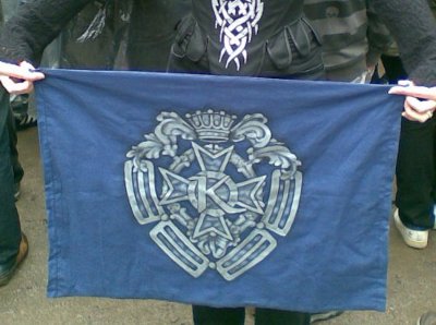
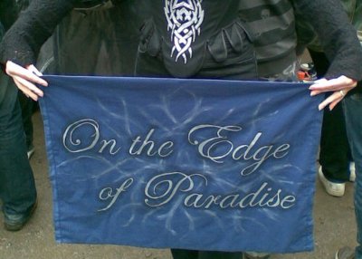
Anyway, flag was the perfect place for the older heraldic
logo, which looked no doubt better painted than as an
applique. I used the same concept as with my earlier
Rammstein-flag, having the logo on one side of the flag
and a piece of song lyrics on the other. The lyrics I
chose are pretty obvious for the occasion, if slightly
elaborate.
Again I
enlarged the picture and made a sablon to sketch the lines
of the crest, and then painted it with black and silver
paint, and made the text side similarly. I had to finish
the latter in a hurry on Friday night, going to all-day
bachelorette party on Saturday. It shows, too, especially
on the messy background.
|
|
A bit pathetic, but I just had to put this
too... A cute picture taken at the back door of a local
club. An overjoyed little fan-girl of fourteen... okay,
twenty-four, wears a silly smile.
(Sorry for bothering, Roy...)
<< Back to the project page |
 |